Editor’s note: This is a guest post by editorial professional Brittany Dowdle.
Accessibility in Publishing
You’ve probably seen those childhood diaries with the heart-shaped lock and little golden key. If the goal is to keep people out of a book, these locks are a great idea: barriers prevent access.
However, most writers are trying to bring people in with their writing. Authors work hard to craft their message and use illustrations, charts, and images to engage their audience through more than just dazzling prose. They want to share hard-won experience, draw readers into their fictional worlds, or show potential clients how to solve their most pressing problems.
Yet, what if I told you that e-books and print books often have built-in locks that keep readers out? That many social media posts and websites, despite their digital potential, are implemented in a way that undermines assistive technologies?

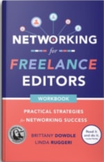
When I wrote Networking for Freelance Editors with my coauthor, Linda Ruggeri, we were both volunteers with the Editorial Freelancers Association’s Diversity Initiative (now Diversity, Equity & Belonging, or DEB). Through our work in that group, we learned how important it was to make sure our book was open and accessible for everyone. We knew that following accessibility best practices would be the key to unlocking our book and welcoming every reader. But we didn’t quite know where to start—it seemed overwhelming.
What Is Accessibility?
What we learned is that “accessibility” is a big umbrella, one that continues to evolve and grow. Here’s what we now know:
- At its core, accessibility is about ensuring that everyone has access to content in a way that is convenient and functional.
- Creating accessible content is a practical goal we can all contribute to—even if we’re not accessibility experts (which we aren’t).
- Publishing material with accessibility in mind requires educating ourselves, going beyond a “this is the way we’ve always done it” mentality, and being open to others’ experiences and needs.
As we prepared our book for publication, Linda and I consulted with our primary book designer, hired an e-book designer who specializes in coding for accessibility, and did our own research, learning from experts and available resources (see the links at the end of this post). We kept our audience in mind, imagined their needs and circumstances, and worked to remove any barriers between our readers and our message. We knew from our own experiences how challenging and isolating it can be as a freelance editor, and we wanted our book to help other editors feel connected and make connections. It was not acceptable for our book’s design or execution to exclude anyone.

After learning how to make our own book more accessible, we now bring our direct experience with crafting accessible content to our publishing clients—and to our own work. Whether we’re editing or writing, we think about how the audience will access and use the content. How will they navigate it? What do different readers need? How can our decisions work with assistive technologies instead of against them?
As I mentioned earlier, accessibility is a large and dynamic subject that can’t be fully explored in one blog post. (I know I’ll be learning about best practices for years to come.) To get started, though, here are some of the considerations we’ve learned to pay attention to.
Accessibility for Print Books
Typography
Books are tangible artifacts, and every aspect of their physical expression can impact accessibility. One of the most basic and important considerations is typography—including font choice, font size, and the spacing of letters and design elements. These choices affect whether readers can access the text visually. For instance, some fonts are easier to read in print, and others tend to work better in digital applications. There are specific fonts designed to aid readers with dyslexia, and there’s a reason large-print books are carried in libraries. Considering typography also means paying attention to things like the use of italics, all caps, text alignment, and spacing between lines (leading) and between characters (kerning).

Color
Color choice and contrast are especially important—in both print and digital content. Color-blind readers and readers with visual impairments can have difficulty distinguishing between certain colors or reading light text set on shaded backgrounds. Similarly, color alone should not carry meaning. Relying on a font or image’s color to convey critical information sets color-blind readers up for confusion and frustration—and it means that your publishing client’s message may be misread or completely inaccessible to their readers. For a visual demonstration of how color contrast affects accessibility, check out the video Color Contrast: Why You Should NEVER Ignore It!
Physical Aspects
What else should we consider when it comes to print? Think about things like printing on matte versus glossy paper to prevent glare, using off-white paper to avoid harsh contrasts, and making sure the paper has an adequate weight (is thick enough) so that text doesn’t bleed through when printed on both sides.
Remember that when the medium is fixed (ink on paper), the design is also fixed, so it’s important to create print materials that serve a wide variety of users.
Accessibility for Digital Content
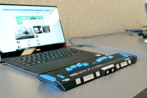
While print accessibility is inherently limited, digital content (i.e., e-books, websites, and social media) has so much potential that we often need expert help to navigate it. This is why Linda and I worked with a designer to code our book in a way that would let assistive technologies—like screen readers and refreshable braille displays—access all the content. In this process, we learned that digital content should be practical, necessary, and easily navigable.
Practical
Editors think about what information readers need, but we also need to think about their practical needs.
For instance, in our e-book, because it’s a workbook, we have a lot of fill-in-the-blank lines. Originally those were formatted as underscore lines, but screen readers and the “read aloud” function in PDFs read them as “underscore underscore underscore underscore underscore underscore,” which is mind-numbing to say the least. Our designer fixed that so readers knew we had provided a blank space for their answers. This change improved accessibility, because it made the experience convenient and practical for the reader.
Necessary
In our workbook, we used graphics that contained words, so for all graphics and visual elements, we created useful alt text (alternative text), which screen readers read to describe the graphic to the reader. This makes the information accessible, instead of being hidden from the reader as an unknowable image.
Similarly, any purely decorative imagery was labeled as such so that screen readers could disregard it. For instance, we had chosen a “cute” bullet point character for the print book, but the designer coded it differently in the e-book so that a screen reader wouldn’t read it as a random, meaningless word object (such as “star” or “happy face”). If an image isn’t carrying meaning, that fact should be conveyed to all readers no matter how they are accessing the content.
Navigable
Perhaps the most important thing we learned is that an accessible e-book (or website, or PDF) is one that gives the reader maximum control over how they access and navigate the content. For this to work, book elements and headings have to be coded appropriately and in logical order. This is something that, as editors, we can help build in to the manuscripts we edit—whether we propose improved narrative structure, insert coding tags, or apply Word styles. When e-books are coded according to the Accessible Books Consortium’s best practices, assistive technologies like screen readers and braille readers function with maximum efficacy. Proper coding allows readers to navigate the e-book according to their needs rather than the “fixed” order set by the author. While this might be less of a concern for readers of fiction, it’s critical for reference works and other nonfiction (like our workbook).
For a demonstration of how screen readers work with online text, check out the video Using a Screen Reader from the University of Washington. Also, to better understand the technology that’s making all of this possible, I recommend “Born Accessible” Publishing, by Linda McDonald, a fellow member of the Professional Editors Network. McDonald explains how the EPUB 3 digital format builds accessibility features into e-books so they seamlessly work with a range of assistive technologies.
An Accessibility Mindset
While some of these technical accessibility concerns might not be within the purview of every editor, having an accessibility mindset will help us recognize opportunities to remove barriers. By educating ourselves, we can provide value to our authors and advocate for their readers, which is always at the core of an editor’s job. The intent here is similar to that of using conscious language, as Crystal Shelley explains in the blog post Conscious Language and the Editor: Q&A with Crystal Shelley.
What’s more, it’s a skill set that differentiates us from editors who don’t offer this type of insight. Learning about accessibility also gives us perspective about how we, as editors, fit in the publishing process and how we can support changes that value—and include—every reader.
And when we market ourselves, participate on social media, and create resources for clients, we can use accessibility best practices in our own work so that we’re welcoming all readers—and, as businesses, we’re reaching all potential clients.
Further Reading
To learn more about accessibility, check out the following links:
Brittany Dowdle (she/her)
Brittany Dowdle is a freelance editor with over ten years’ experience in the publishing industry. She has edited the work of best-selling traditionally published authors and award-winning indie authors. She is editor and owner at Word Cat Editorial Services, and coauthor of Networking for Freelance Editors, www.networkingforeditors.com.
Brittany graduated summa cum laude from the University of North Georgia with a degree in English. She is a founding member of the Editorial Freelancers Association’s Diversity Initiative (now Diversity, Equity & Belonging) and helped design the Welcome Program, acting as its codirector in 2019–2020.
Brittany lives in the north Georgia mountains with her adventurous husband and their three cats, seven chickens, and many wild neighbors of the four-legged variety. When she’s not editing, writing, or exploring in the woods, Brittany may be found reading a book in a patch of sunshine.
